# CSS 容易忘记的一些属性
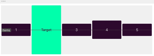
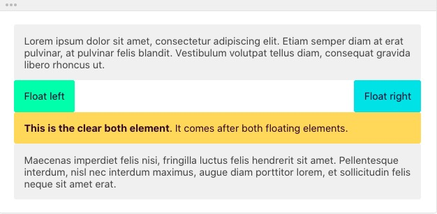
# clear
none
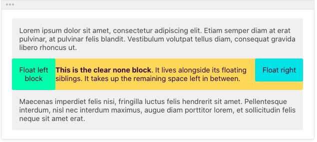
left
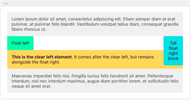
right
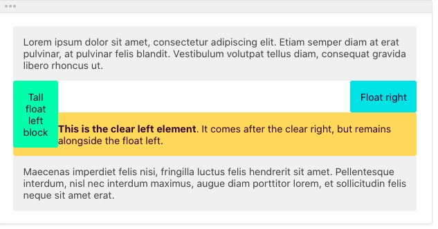
both
# text-align 属性
- text-align:justify 两端对齐
- text-align 属性只对块级元素起作用,行内级元素无效
- 这一居中显示可以用 margin 0 auto 表示
# line-height 属性
行高指的是文本间基线的距离,其单位可以为 px,百分比,em 文字基线 顶线 划分
行高就是 inline-box 的高度,默认情况下行内元素是基于 base-line 对齐的


图片 1px 问题:因为图片本身也是行内元素,也是基于基线对齐,基线距离底部会有一个间隙,所以会有留白,解决方案:
font-size:0或者vertical-align:bottom
# vertical-align
垂直对齐方式 只作用于行内元素,块级元素设置无效
 {% note purple no-icon %}
vertical-align:top:垂直对齐于一行内最高的元素vertical-algin:Text-top:垂直对齐于文本顶部vertical-align:middle:对齐于文本中线vertical-align:baseline:对齐于文本基线(英文字母文本底部)vertical-align:Text-bottom:对齐于文本底部vertical-align:bottom:对齐于行内底部最低元素
# word-spacing letter-spacing text-transform
white-space no-wrap 不换行 word-spacing 单词之间间隔 letter-spacing 字母之间的间隔 text-transform:capitalize(
首字母大写)|uppercase(字母大写)|lowercase(字母小写)|none()
# text-decoration
文本修饰
underline:下划线overline:上划线line-through:删除线blink:闪烁效果none
# 动态伪类
只有当用户交互时才显示,分为锚点伪类和用户行为伪类
锚点伪类
:link :visted
行为伪类
:hover :active :focus
# CSS3 新增 UI 元素伪类
:disable(input 框的未选中的伪类) :enabled(input 框的可选中的伪类) :checked(单选框或者复选框的选中伪类)
# css3 结构类
:first-child-第一个子元素类:last-child-最后一个子元素类:nth-child(N)-第 N 个子元素类:nth-of-type(N)指定类型的第 N 各元素div:nth-of-type(2) 只匹配 div 的第二个元素
nav > a:not(last-of-type)not 选择器 表示除了最后一个 a 标签 其他的元素的
# 伪元素
用于向某些选择器设置特殊样式 语法格式:Element::pseudo-element 只作用于块级元素 伪类
::first-line块级第一行::first-letter块级元素第一个字::before::after这一类伪元素只能用 content 表示 而且都是行内元素,块级第一个元素,不是真实存在 html 支持一切 css 样式
div::before {
  content: "ABC";
}
::selection控制文本选中的背景色和前景色 同样也是作用于块级元素
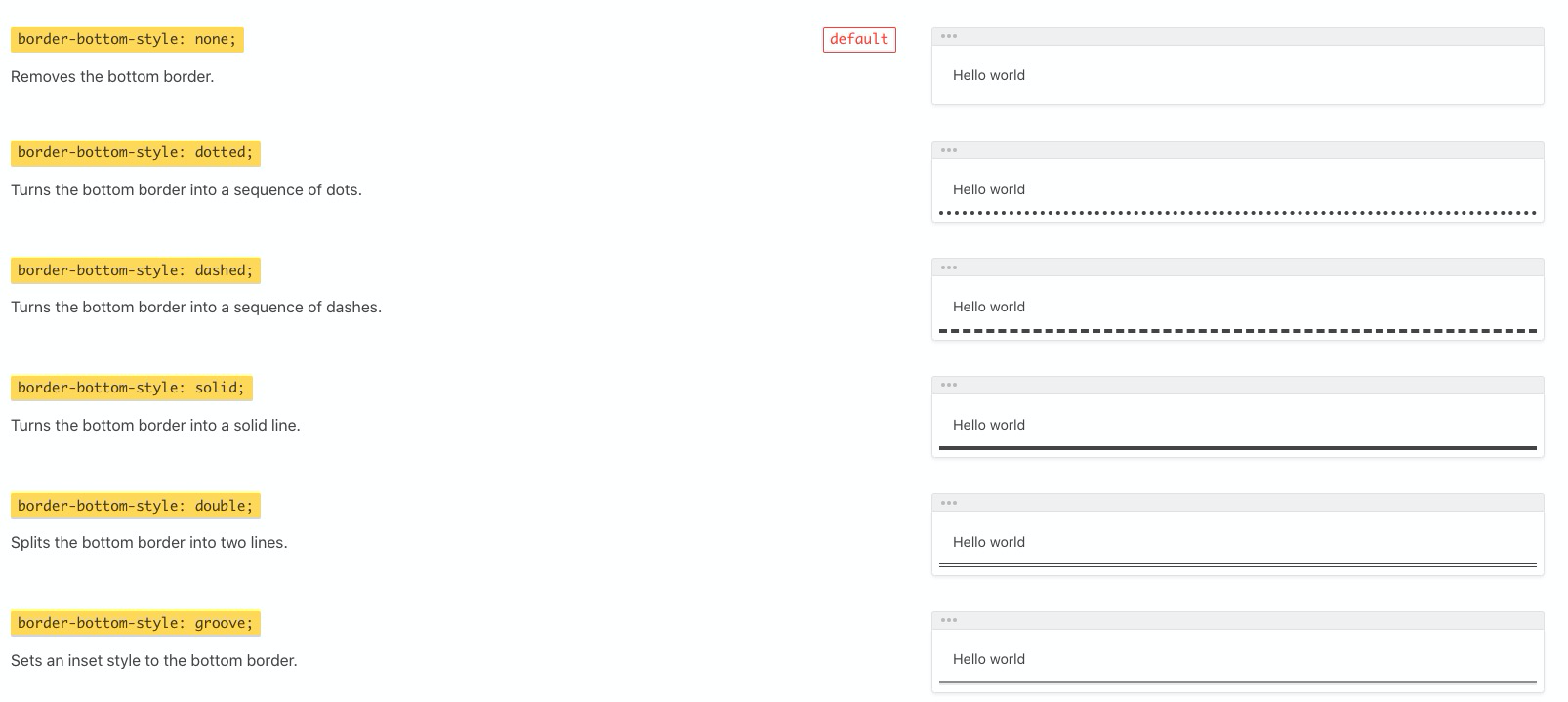
# border
Shorthand property for border-width border-style and border-color
# border-radius 拓展
border-top-left-radius 左上角弧度 border-top-right-radius 右上角弧度 border-bottom-right-radius 右下角弧度 border-bottom-left-radius 左下角弧度 {% endnote %}
(chrome 火狐 ie 欧朋)
兼容性写法
border-radius 50%
-webkit-border-radius 50%
-moz-border-radius 50%
-ms-border-radius 50%
-o-border-radius 50%
border 实现三角形
.div {
  width: 0;
  height: 300px;
  border-bottom: 30px solid red;
  border-left: 30px transparent;
  border-right: 30px transparent;
}
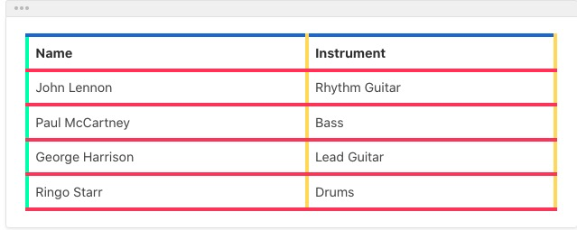
# border-collapse
定义表格边框是分开还是折叠。
border-collapse: separate
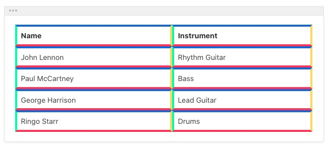
border-collapse: collapse
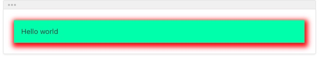
# box-shadow
原理就是在原来的盒子下盖住一个盒子 然后控制颜色偏移 模糊
属性: - 水平偏移 - 竖直偏移 - 模糊 - 扩展(在已有的偏移量上四条边同时增加对应值) - 颜色 - 偏移种类
举例:element 的基础阴影:基础投影 box-shadow: 0 2px 4px rgba(0, 0, 0, .12), 0 0 6px rgba(0, 0, 0, .04)

水平竖直偏移:box-shadow: 2px 6px;
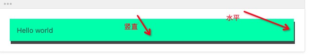
水平竖直颜色:box-shadow: 2px 6px red;
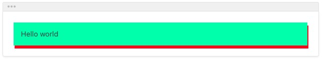
水平竖直颜色:box-shadow: 2px 4px 10px red;
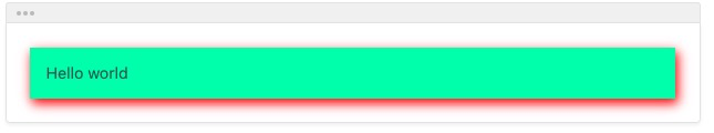
水平竖直模糊扩展颜色:box-shadow:2px 4px 10px red;
# background
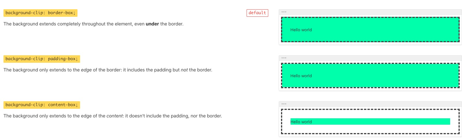
background-clip - 背景图像区域
- border-box
- padding-box
- content-box
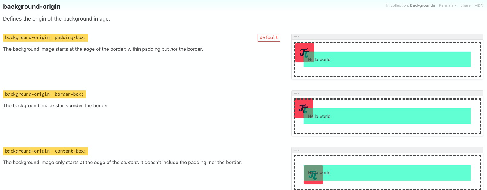
background-origin -相对于背景偏移的初始区域
- border-box
- padding-box
- content-box
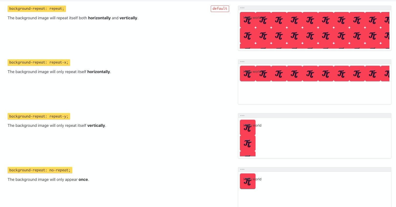
background-repeat
- repeat
- repeat-x
- repeat-y
- No-repeat
background-position
x% x%
ex:bottom right
ex:center center

background-size
auto auto:图片保持原有尺寸,容器较小时部分图片展示不完全
120px 80px
100% 50%
contain
cover
background 完整写法
CSS <!-- background:color position size repeat origin clip attachement url --> background:#fff center 50% no-repeat content-box content-box fixed url()
# gradient
gradient 分为线性渐变和径向渐变
线性渐变-linear-gradient
默认的渐变方向从上到下
//从上到下有蓝色渐变到红色
background:linear-gradient(bule,red)
background:-webkit-linear-gradient(blue,red)
background:-moz-linear-gradient(blue,red)
background:-ms-linear-gradient(blue,red)
background:-o-linear-gradient(blue,red)
从左往右线性渐变写法
<!--从左往右-->linear-gradient(to direction,color1,clor2...)-webkit-linear-gradient(begin direction,color1,color2...)-moz-linear-gradient(end direction,color1,color2...)-ms-linear-gradient(end direction,color1,color2...)标准写法: linear-gradient(
    to right,
    blue,
    red
  ) -webkit-linear-gradient(left, blue, red) -moz-linear-gradient(right, blue, red) -ms-linear-gradient(right, blue, red);
对角线渐变
<!-- 左上角到右下角渐变 -->
linear-gradient(to right bottom,blue,right)
<!-- chrome浏览器和其他浏览器相反 一个是定期开始位置 一个定义结束位置 -->
-webkit-linear-gradient(left top,blue,right)
-moz-linear-gradient(right bottom,blue,red)
偏移角度渐变写法

0deg从下往上90deg从左往右180deg从右往左background: linear-gradient(90deg, red 10%, orange 30%, blue 100%) //这种写法 百分数表示从这个数值的百分数开始想另一个颜色渐变
  10% - 30% red向orange渐变 30% - 100% orange向blue渐变;
带有-web-kit 的 chrome 浏览器的兼容 0deg 是从左到右 然后增大角度它是轴逆时针方向,也就是走左下角
-webkit-linear-gradient(0deg,red,blue)普通情况下 0deg 是从下往上 也就是结束方向
linear-gradient(0deg,red,blue)
# text-shadow
- 属性值:
- 水平偏移
- 竖直偏移
- blur 模糊
- color
# text-overflow
- 属性值:
- clip 溢出文本隐藏
- ellipsis 显示省略号
- string (只兼容火狐浏览器)
# 文字换行
- overflow-wrap(word-wrap) 是否保留单词
- word-break 针对多字节文字 设定保留的单位
- white-space 空白处是否断行 no-wrap
# @font-face
语法规则
@font-face{
  font-family:<webfontname>
  src:<source>[<format>]
  [font-weigth:<weight>];
  [font-style:<style>]
}
实例:
@font-face {
  font-family: myFirstFont;
  src: url("Sansation_Light.ttf"), url("Sansation_Light.eot"); /* IE9 */
}
{% note pink no-icon %}
Internet Explorer 9 只支持 .eot 类型的字体, Firefox, Chrome, Safari, 和 Opera 支持 .ttf 与.otf 两种类型字体
{% endnote %}
推荐引入字体通用模板
@font-face
  font-family 'YourWebFontName'
  src url('YourWebFontName.eot'); /* IE9以上 */
  src url('YourWebFontName.eot?#iefix')format('embedded-opentype'),/*兼容IE6-IE8*/
  url('YourWebFontName.ttf')format('truetype'),/*Safari,Andriod ios*/
  url('YpurWebFontName.woff')format('wodff'),/*Mordern Browser*/
  url('YourWebFontName.svg#YourWebFontName')format('svg') /*除了ios*/
使用直接 font-family:YourWebFontName 即可
# CSS3 2D 转换
rotate() 平面 2d 旋转 通过角度参数对元素进行旋转 正角度为顺时针 语法:transfrom:rotate(angle)
translate() 平移-正方向 右 下
translateX() translateY() translate(X,Y)
scale() 缩放 参数为缩放比例 缩放时水平方向竖直方向的坐标原点在元素几何中心
scaleX() scaleY() scale(X,Y)
skew() 扭曲与斜切
skewX() 参数正角度逆时针方向斜切 skewY() x 轴方向 正角度顺时针斜切
# CSS3 3D 转换
rotate3d()
rotateX() 对象在 x 轴上旋转 90deg 时图片消失 正方向手掌向上弯曲 rotateY() 在 y 轴旋转 向里旋转为正角度 正方向手掌想里弯曲 rotateZ() z 轴方向旋转 类似于二维方向旋转
translate3d()
translate3d(X,Y,Z) 加速 cpu 渲染 z 轴正方向指向我们
scale3d()
# Transfrom 坐标系
transfrom-origin 改变转换元素的位置
默认是元素几何中心点为基点 transfrom-origin: left top 围绕左上角旋转
transfrom-style 属性 定义指定嵌套元素是怎样在三维空间呈现
transfrom-style: flat | preserve-3d perspective:number 当数值越来越大 transform 的元素就会感觉越来越近
# CSS transition 属性
过渡属性:
transition-property:指定过度的对象
transition-property:none | all(默认值) | property(指定颜色 或者 opacity 或者等等属性)
transition-duration :指定过渡的时间
transition-timing-function 动画类型
linear 线性过度(匀速) ease 平滑过渡 ease-in 由慢到快 ease-out 由快到慢 ease-in-out 慢到快到慢 step-start
transition-delay 指定过度的延迟时间
标准写法
transition: <transition-propetry><transition-duration><transition-timing-function><transition-delay>;
# animation (opens new window)
animation-name 动画名称
animation-duration 动画持续时间 默认为 0
animmation-timing-function
linear 线性过渡 ease 平滑过渡 ease-in 慢到快 ease-out ease-in-out
animation-delay 定义动画的延迟时间
animation-iteration-count 动画循环次数
infinite 无限次数 count count 次数
animation-direction 定义动画的方向
normal 正方向 reverse 反方向 alternate 动画现正常运行然后再反方向 alternate-reverse 相反
标准写法
animation: name duration timing-function delay iteration-count direction fill-mode play-state;
# @keyframes 关键帧
语法:
@keyframes animationname {
  keyframes-selector {
    css-styles
  }
}
三个均为必写项
- animationName
- keyframes-selector 动画持续时间百分比 0-100 from(0%) to(100%)
- css-styles 样式
最好添加
-webkit-animation兼容
# align-self
Works like align-items, but applies only to a single flexbox item, instead of all of them.
align-self: auto:目标元素会集成父容器align-items的值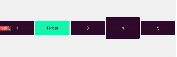
align-self:flex-start:目标元素位置在交叉轴开始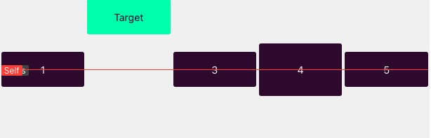
align-self: flex-end:目标元素位置在交叉轴末端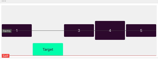
align-self:center:目标元素位置在交叉轴居中If the container has
align-items: flex-startand the target hasalign-self: center, only the target will be at the center of the cross axis.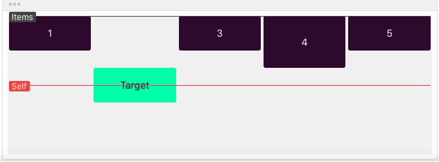
align-self: baseline:If the container hasalign-items: centerand the target hasalign-self: baseline, only the target will be at the baseline of the cross axis.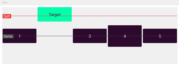
align-self:stretch:If the container hasalign-items: centerand the target hasalign-self: stretch, only the target will stretch along the whole cross axis.